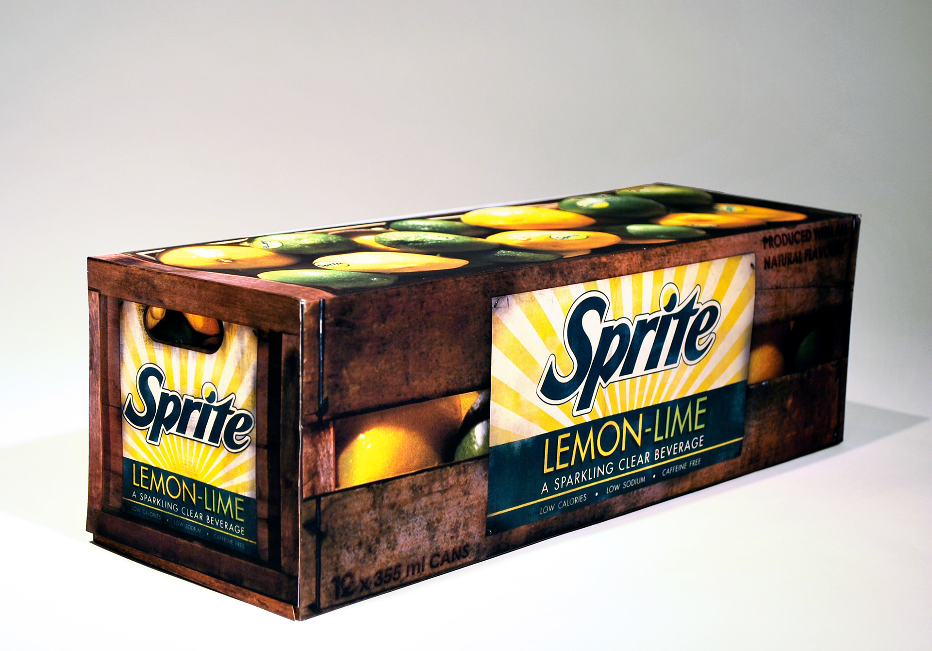
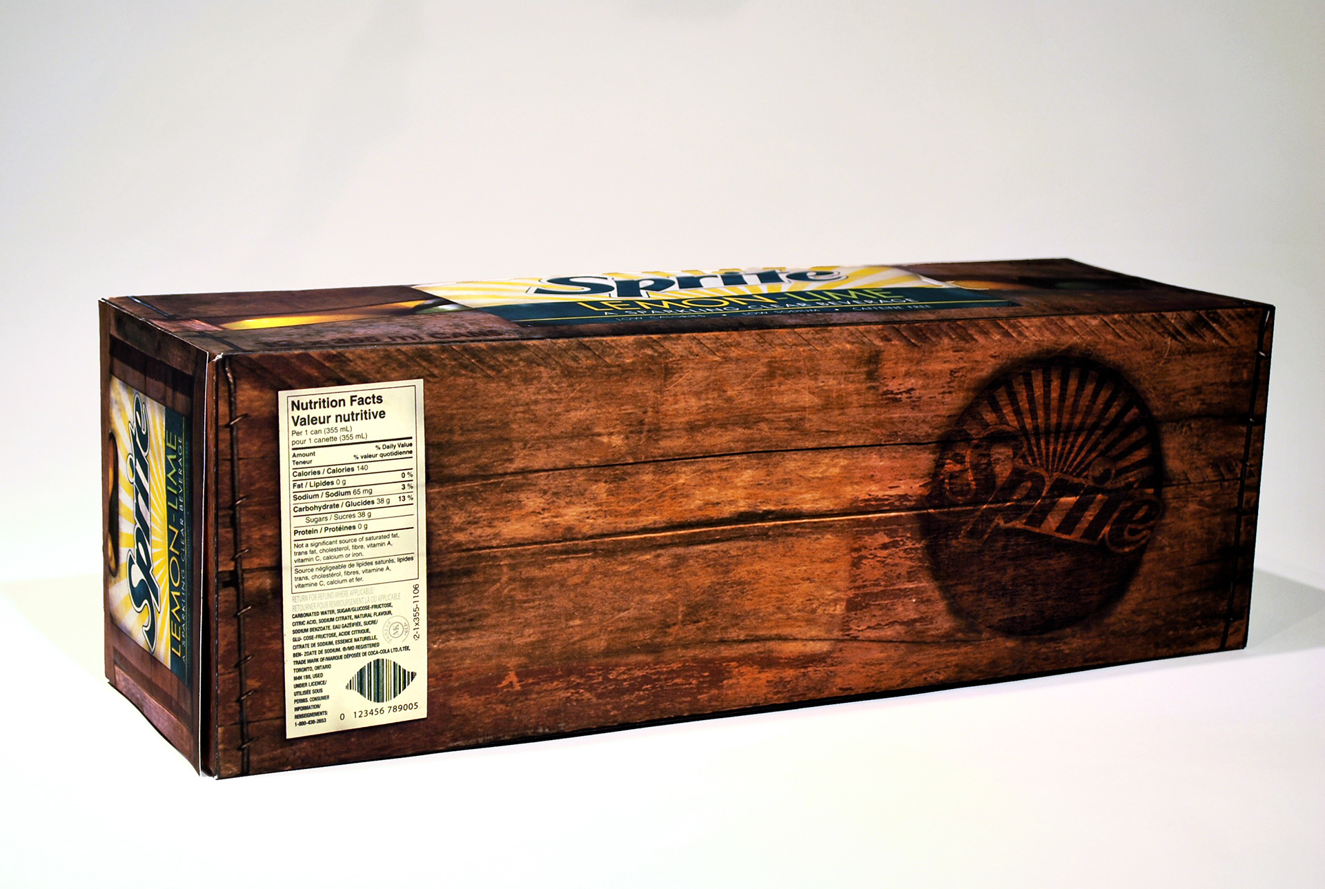
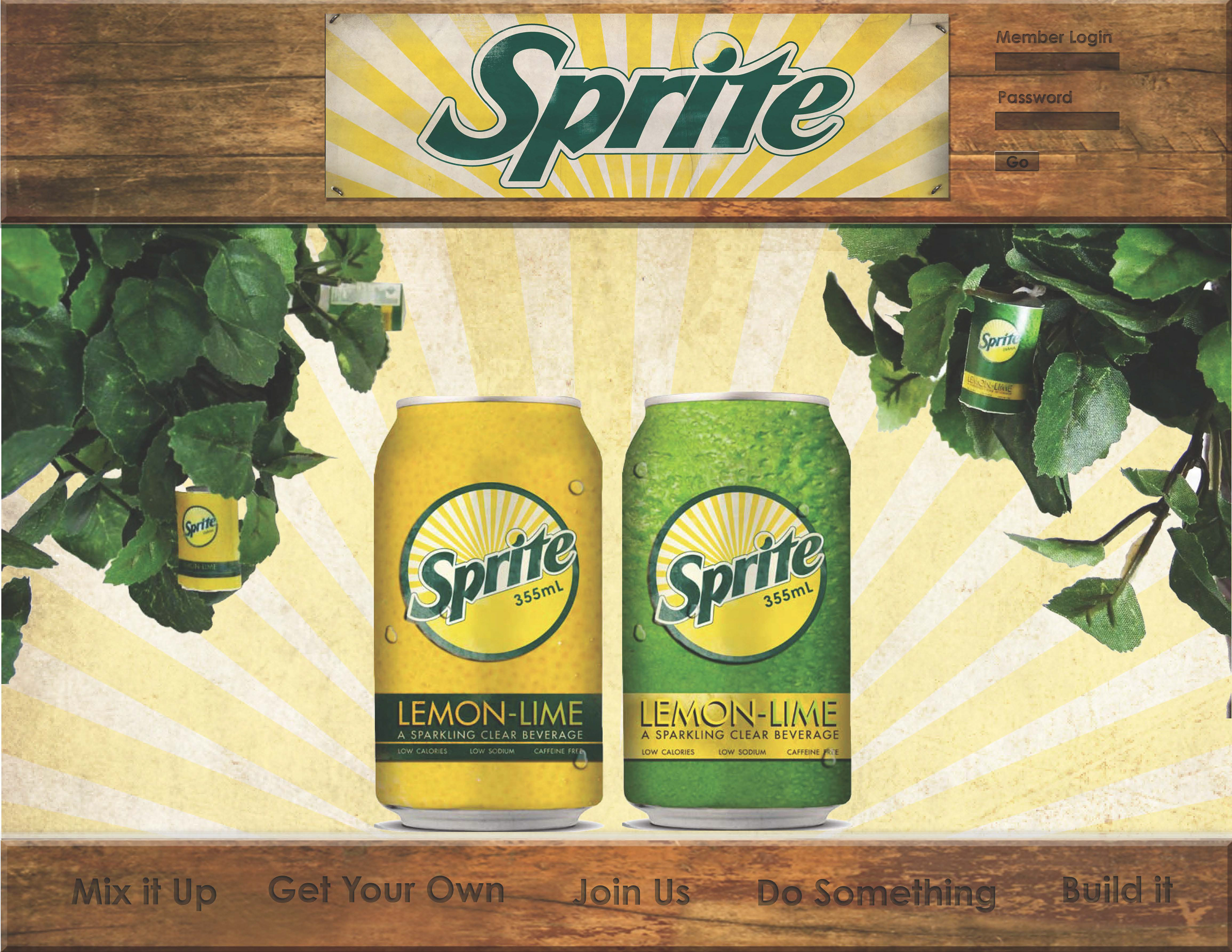
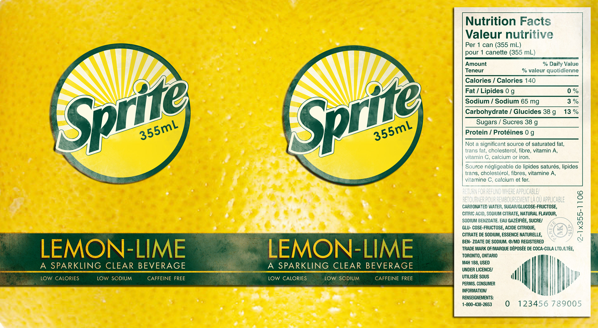
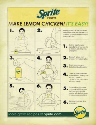
The Sprite campaign included five parts: box, can, interactive PDF, advertisements, and POP. The redesign for the sprite box is based on the image of Sprite as a healthier beverage than the average cola. We created a vintage-looking crate with lemons and limes inside to give the feel that it is fresh out of the orchard. To continue our healthy, organic theme, our cans were made in the likeness of lemon and lime skins. In addition, we created Sprite produce stickers to further the illusion of real, organic juices. Our interactive PDF mimicked our POP design by looking similar to a lemonade stand. The imagery was kept consistent to ensure unity. Our advertisements tied in with the vintage theme as well as further pursuing the organic image, having instructions on how to create lemon chicken with Sprite.